Physical therapy
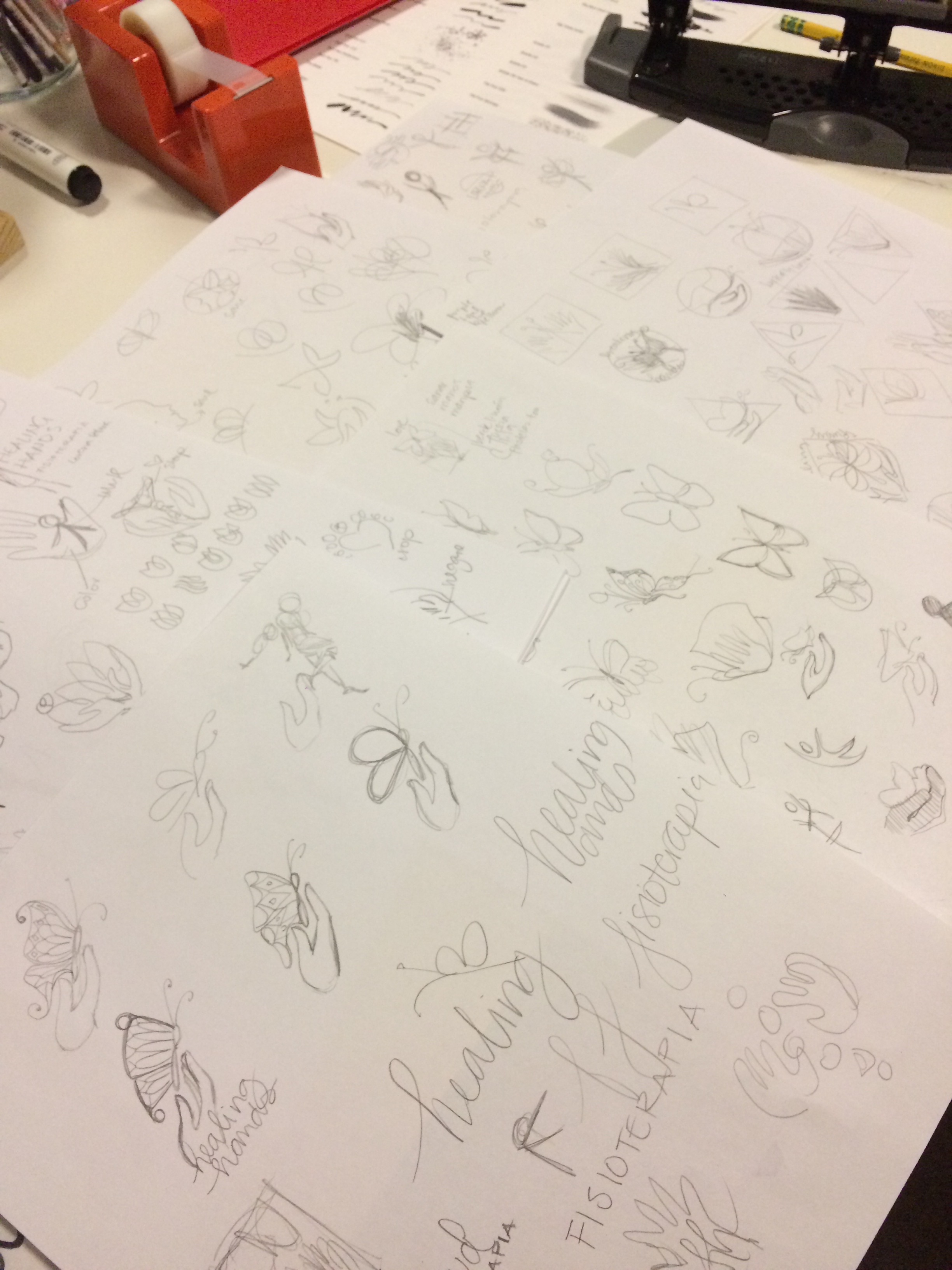
A logo for my sister
My sister is starting her solo Physical Therapy practice in Ecuador. I enjoyed hearing about the way she does things and her goal of helping people help themselves. She combines Western and Eastern methods with everything else she knows to get people quickly on the road to recovery.
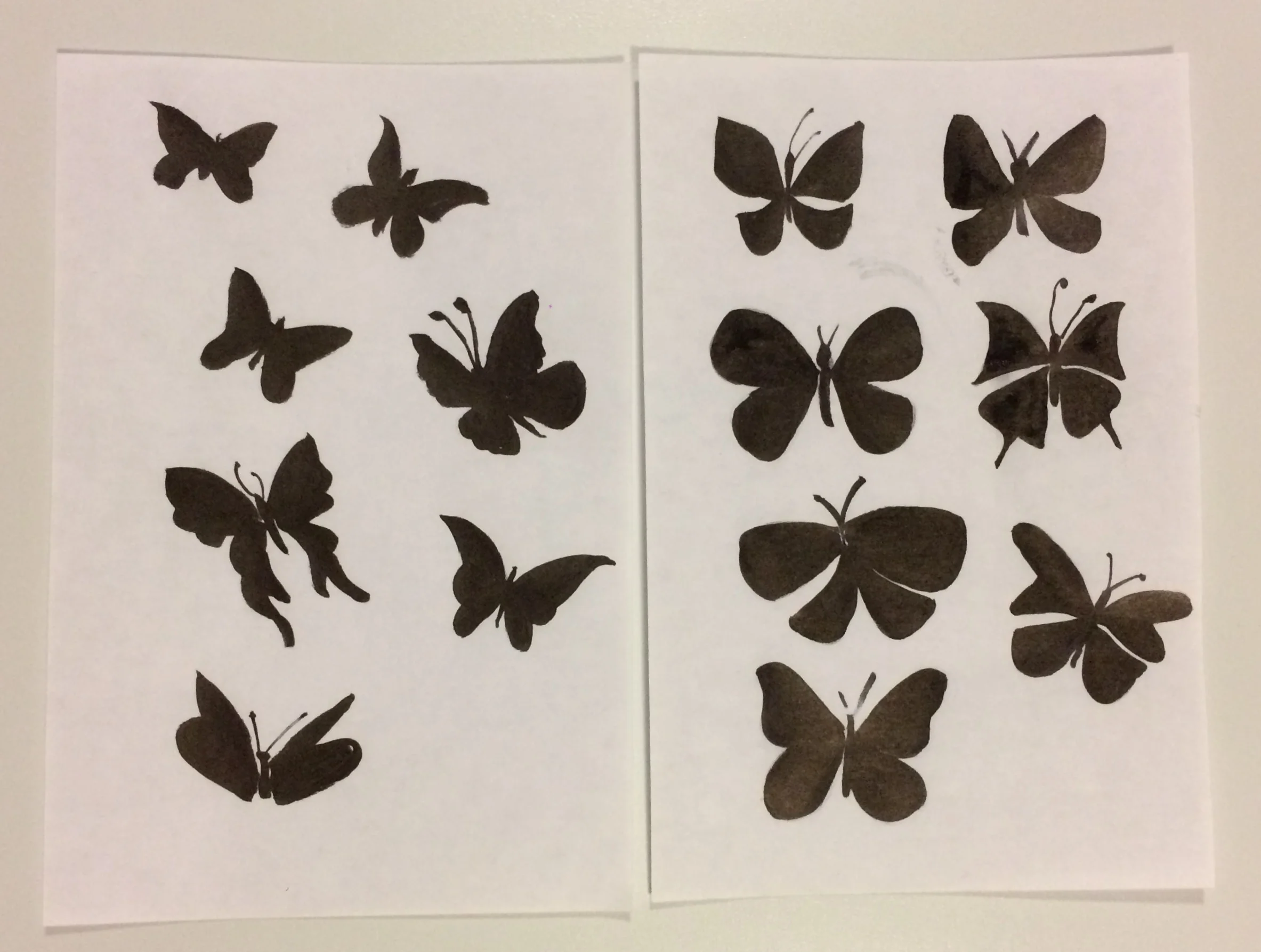
When we talked about her logo and she was thinking about a name, hands and butterflies kept coming up. Hands as her prime tools in her job and the butterflies as a delicate symbol of life and change.
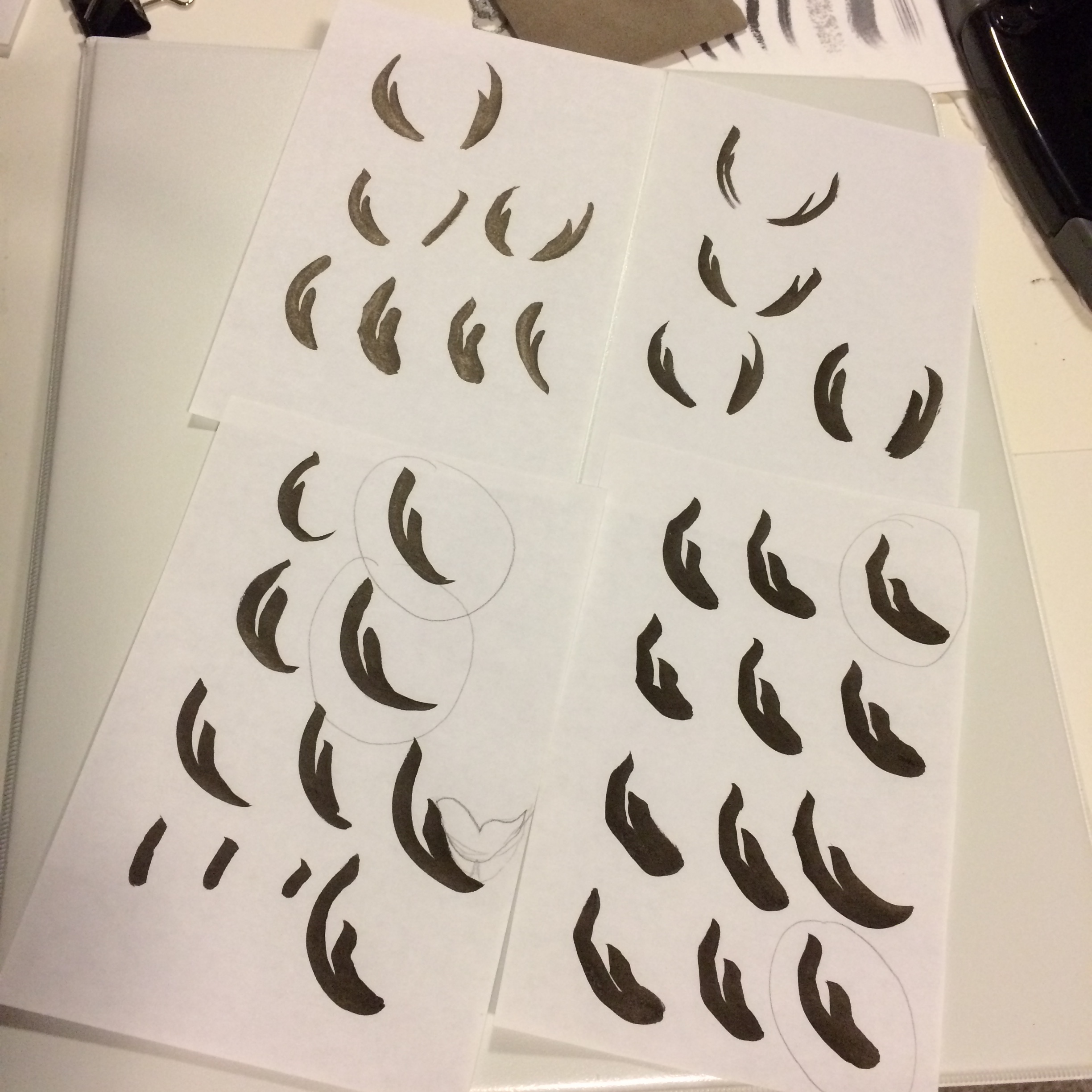
Here is the process we went through:
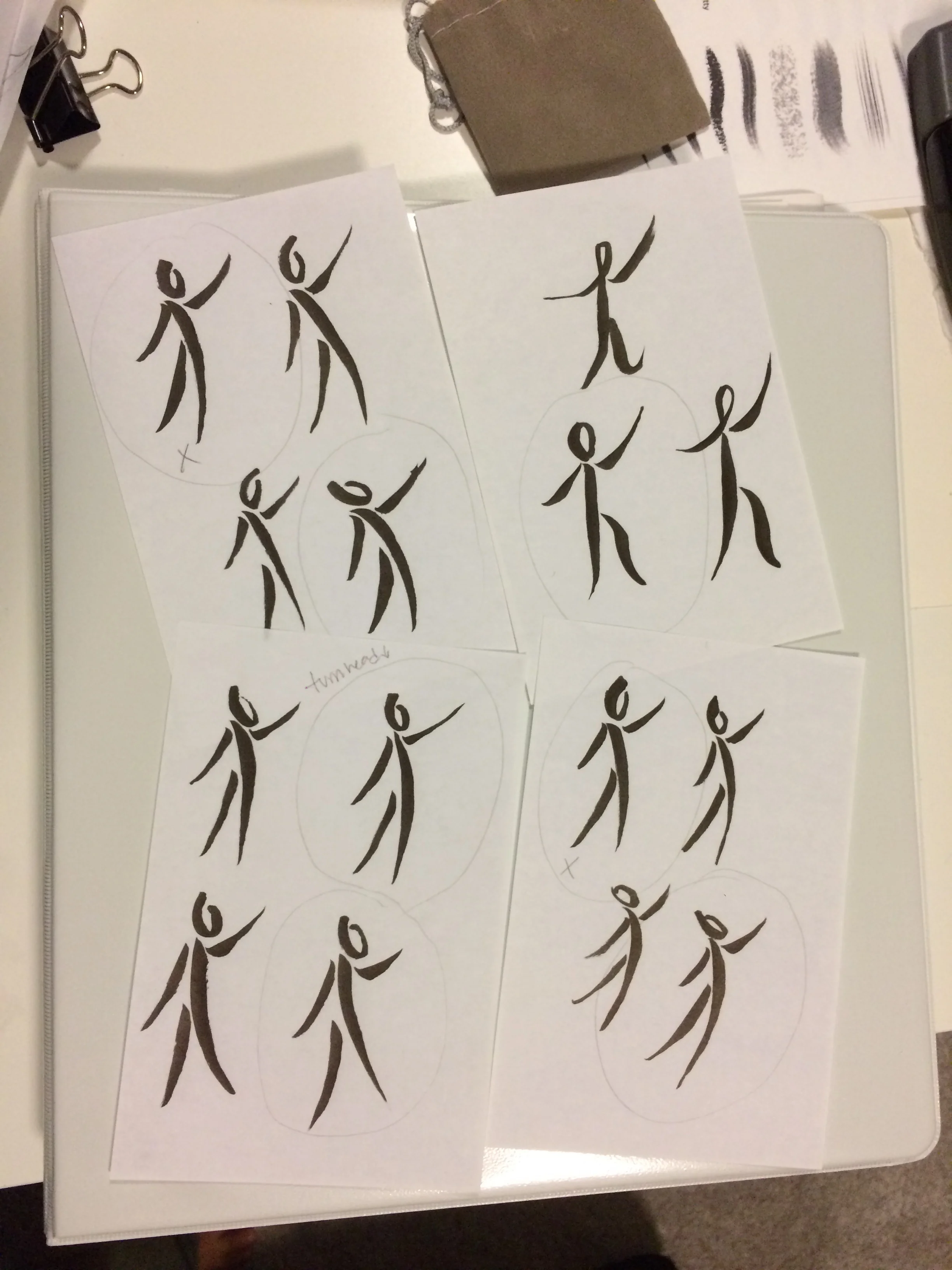
So, in her logo, the hands are the base, as they are her main instruments. Notice the left hand is bigger to signify the beginning of treatment and the right hand is smaller to represent her hope of less involvement down the way, guiding her patients to recovery.
The figure is in an active standing position reaching upwards, reaching to the life and beauty of the flying butterfly, I am sure working hard.
Lore, I love you and I wish you the best in your practice!